Want to know what the Florida housing market graph 50 years looks like? Buckle up, because we're about to take a whirlwind tour through five decades of home price fluctuations in the Sunshine State. Understanding this history is crucial whether you're a seasoned investor, a first-time homebuyer, or just plain curious about Florida real estate.
This isn't your average, dry statistical report. We'll look at the raw data, sure, but we'll also dig into the why behind the numbers. We'll explore major events, economic shifts, and even speculate on what the future might hold for Florida's dynamic housing market. I've been following the Florida real estate market for years, and trust me, it's been one heck of a ride.
Florida Housing Market Graph 50 Years: A Deep Dive
The Data: A 50-Year Picture of Florida Housing Prices
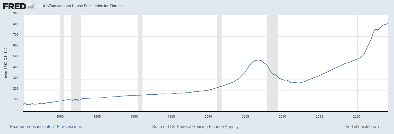
Our journey starts with the All-Transactions House Price Index for Florida (FLSTHPI), sourced directly from the Federal Reserve Bank of St. Louis's FRED database. This index provides a quarterly snapshot of average home prices, adjusted for inflation. This data, available since 1975, gives us a powerful glimpse into the long-term trends of the Florida housing market graph 50 years.
Remember, this is an index, meaning the starting point (1980:Q1) is set at 100. So, a value of 200 would signify that home prices have doubled since that baseline. While not every individual home's price will match the index precisely, it gives us an excellent overall picture.
I've personally found this data invaluable in my own real estate analyses. Its consistent methodology makes it a reliable tool for understanding long-term price changes in the state.
Here's a condensed table highlighting key periods, but we will dive into specifics later:
| Period | Notable Trends |
|---|---|
| 1975-1980 | Relatively slow growth |
| 1980-2000 | Gradual, steady increase |
| 2000-2006 | Boom years, rapid price appreciation |
| 2007-2011 | The Great Recession: sharp decline |
| 2012-2020 | Recovery and moderate growth |
| 2020-Present | Exponential growth, driven by various factors |
Early Years (1975-1980): A Foundation Is Laid
The early years of the Florida housing market graph 50 years reveal relatively modest growth. Looking at the data, the index increased from around 65 in 1975 to 100 by 1980. This period was one of gradual development, with population growth and economic expansion setting the stage for more significant changes later on. Many factors contributed, including slower population growth compared to what we’d see in later decades. Think of it as the quiet before the storm.
The Steady Climb (1980-2000): Gradual Growth and Regional Variations
From the 1980s to the turn of the millennium, the Florida housing market graph 50 years shows a consistent upward trend. The increase was not uniform across the state, though. Coastal areas and popular retirement destinations experienced comparatively faster growth, while other regions moved at a slower pace. This reflects the beginning of the diversification of Florida's housing market. Different regions experienced fluctuations based on economic influences specific to those areas.
The Boom and the Bust (2000-2011): The Housing Bubble and Its Aftermath
The first decade of the 21st century presented one of the most dramatic periods in the history of the Florida housing market graph 50 years. The early 2000s saw rapid appreciation in home prices – a period often referred to as a housing bubble. Low-interest rates, easy credit, and speculation drove prices to unprecedented levels. However, this boom was unsustainable. The 2008 financial crisis, stemming from the subprime mortgage crisis, burst the bubble. This period witnessed a severe decline in home prices, with many homeowners facing foreclosure. I’ve personally witnessed the struggles of families during this time and the lasting impact on the market remains very real.
Recovery and Resurgence (2012-2020): A Slow but Steady Climb
The period after the Great Recession saw a slow but steady recovery. While home prices didn’t return to their pre-crash highs immediately, the Florida housing market graph 50 years illustrates a gradual upward trajectory. Cautious lending practices and government interventions aimed to stabilize the market and prevent further collapse. While growth was slower than during the boom, the recovery showed resilience. Florida's economic diversification played a role as well.
The Pandemic Surge (2020-Present): Unprecedented Growth
The Florida housing market graph 50 years reaches a remarkable inflection point starting in 2020. The COVID-19 pandemic triggered an unexpected surge in home prices. Several factors contributed to this unprecedented boom: low-interest rates, increased remote work opportunities (leading to a migration to Florida), and a shortage of available housing. These factors caused an exceptionally rapid increase in home values, creating both opportunities and challenges for buyers and sellers.
This period underlines just how unpredictable the market can be. I’ve watched many forecasts fall short in this era of unexpected change.
Analyzing the Florida Housing Market Graph 50 Years: Key Observations
Looking at the complete Florida housing market graph 50 years, some overarching trends stand out:
- Long-term Appreciation: Despite periodic downturns, the long-term trend is one of steady price appreciation.
- Cycles of Boom and Bust: The market has exhibited distinct periods of rapid growth (boom) followed by correction or decline (bust).
- Regional Variations: Price changes aren't uniform across the state. Coastal regions and major urban centers generally experience faster growth.
- External Factors: Economic conditions, interest rates, and population shifts significantly influence home prices.
- Supply and Demand: The balance of supply and demand plays a crucial role, with shortages often leading to rapid price appreciation.
Future Predictions: What Lies Ahead for Florida Real Estate?
Predicting the future of the Florida housing market graph 50 years is always a risky proposition. However, considering past patterns and current market dynamics, we can speculate on some potential scenarios.
- Continued Growth, but Perhaps at a Slower Pace: While it is unlikely to maintain the explosive growth of the last few years, we can expect prices to likely continue increasing over the long term.
- Increased Volatility: Market cycles are likely to persist, meaning periods of faster and slower growth.
- Rising Interest Rates: Interest rates will likely exert a moderating influence on prices.
- Infrastructure Development: Investments in Florida's infrastructure could lead to regional variations in home price growth.
- Climate Change Concerns: The impact of climate change, including sea-level rise, might affect the desirability and value of properties in certain areas.
This is simply educated speculation, of course. A lot can change in the coming years. In my experience, adaptability and a keen eye on market changes are crucial for success in Florida real estate.
Florida Housing Market Graph 50 Years: A Conclusion
The Florida housing market graph 50 years tells a fascinating story of growth, resilience, and unexpected shifts. Understanding the past helps us navigate the present and prepare for the future. From periods of quiet growth to explosive booms and challenging corrections, the market has proven its dynamism.
I hope this deeper dive provides you with a better understanding and appreciation of the complex world of Florida real estate. It is a market brimming with opportunities, but also one that demands careful planning, smart decisions, and an understanding of the forces that shape it. Remember to always consult with professionals and conduct thorough research before making any real estate decisions.
Related Articles:
- 24 Florida Housing Markets Could See Home Prices Drop by Mid 2026
- Florida Housing Market Forecast: 5 Cities at High Risk of Price Crash
- Is a Major Florida Housing Market Crash Coming in 2026?
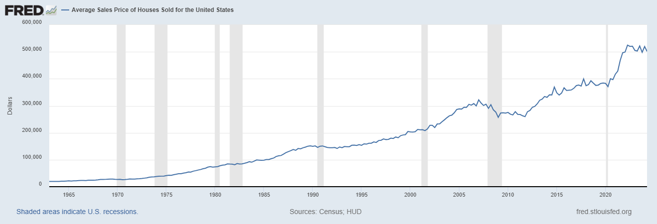
- House Price Graph Last 20 Years USA
- Housing Market Graph 50 Years: Showing Price Growth
- San Diego Housing Market Graph 50 Years: Analysis and Trends
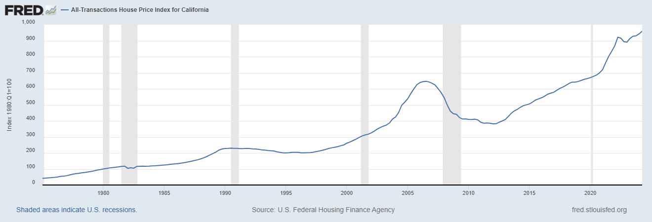
- California Housing Market Graph 50 Years
- Average Housing Prices by Year in the United States
- Average Home Value Increase Per Year, 5 Years, 10 Years
- How Much Did Housing Prices Drop in 2008?
- Housing Market Crash 2008 Explained: Causes and Effects