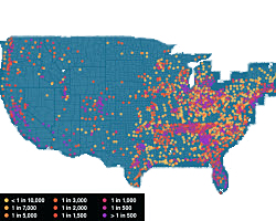
 We've all heard that the housing bubble's pop led to thousands of foreclosures, but its interactive maps like this that really show how prevalent the problem was — and still is. Part of a project on 30 election issues, the map below uses data from RealtyTrac to display foreclosure rates by county.
The darker the color is, the higher the rate of foreclosure. You can see what each color represents in the legend on the lower left.
By pressing play, you can see how many more dots show up on the map, indicating a higher prevalence of foreclosures. But perhaps more disturbing, the map displaying the most recent data in July 2012 doesn't look much better than past maps: The crowded dots maintain the visual effect of a foreclosure epidemic.