 After peaking in 2006, the median U.S. house price fell about 30%, finally hitting bottom in late 2011. Since then, house prices have rebounded strongly and are nearly back to the pre-recession peak.
However, conditions in the latest boom appear far less precarious than those in the previous episode. The current run-up exhibits a less-pronounced increase in the house price-to-rent ratio and an outright decline in the household mortgage debt-to-income ratio—a pattern that is not suggestive of a credit-fueled bubble.
Starting in the early 2000s, the U.S. housing market experienced a tremendous boom. House prices, private-sector construction employment, new housing starts, and household mortgage debt all rose in unison. An accommodative interest rate environment combined with lax lending standards, ineffective mortgage regulation, and unchecked growth of loan securitization all helped fuel an over-expansion of consumer borrowing.
An influx of new home-buyers with access to easy mortgage credit helped bid up house prices to unprecedented levels relative to rents or disposable income. The run-up, in turn, encouraged lenders to ease credit further on the assumption that house prices would continue to rise.
Similarly optimistic home-builders responded to the price signals and embarked on a record-setting building spree such that, at one point, the construction sector employed 5.7% of American workers, the highest percentage since 1959.
But when the various rosy projections failed to materialize, the housing bubble burst, setting off a chain of defaults and financial institution failures that led to a full-blown economic crisis. The Great Recession, which started in December 2007 and ended in June 2009, was the most severe U.S. economic contraction since 1947 as measured by the peak-to-trough decline in real GDP.
After peaking in March 2006, the median U.S. house price fell about 30%, finally hitting bottom in November 2011. Since then, the median house price has rebounded strongly and is nearly back to its pre-recession peak. In some parts of the country, house prices have reached all-time highs. This Economic Letter assesses recent housing market indicators to gauge whether “this time is different.”
We find that the increase in U.S. house prices since 2011 differs in significant ways from the mid-2000s housing boom. The prior episode can be described as a credit-fueled bubble in which housing valuation—as measured by the house price-to-rent ratio—and household leverage—as measured by the mortgage debt-to-income ratio—rose together in a self-reinforcing feedback loop. In contrast, the more recent episode exhibits a less-pronounced increase in housing valuation together with an outright decline in household leverage—a pattern that is not suggestive of a credit-fueled bubble.
Boom-Bust-Boom
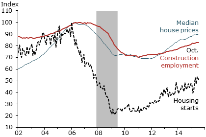
To get a sense of housing market conditions, we look at three important indicators going back to the year 2002: the median U.S. house price, the number of private-sector workers employed in construction, and the number of new housing starts, including both single- and multi-family homes. For comparison, each series is normalized to 100 at its pre-recession peak. Figure 1 shows that all three housing market indicators peaked in 2006 and then began protracted declines that lasted for several years. From peak to trough, the median house price and construction employment both dropped about 30%, while new housing starts plummeted nearly 80%.
Source: Bureau of Labor Statistics (BLS), Census Bureau, and Haver Analytics.
Data are seasonally adjusted and indexed to 100 at pre-recession peak.
Since bottoming out, the median house price has recovered to a level that is only 8% below its prior peak. Construction employment has recovered to around 17% below its prior peak. In contrast, the recovery in new housing starts has been more sluggish; the series remains roughly 50% below its prior peak—suggesting that homebuilders are exercising caution in light of the substantial overbuilding that occurred during the mid-2000s. The pattern in Figure 1 also suggests that there may be further upside growth potential for the housing market; continued high house prices should contribute to more building activity and more construction jobs.
The Latest Boom is Different
When viewing any substantial run-up in asset prices, history tells us that the phrase “this time is different” should be met with a healthy degree of skepticism. Still, the increase in the median house price since 2011 appears to differ in significant ways from the prior run-up.
The price-to-rent ratio for housing is a valuation measure that is analogous to the price-to-dividend ratio for stocks. Valuation ratios are useful for gauging whether an asset price appears excessive relative to its underlying fundamental value. The fundamental value is typically measured by the present value of expected future cash or service flows accruing to the owner. Dividends are the cash flows from stocks. Service flows from housing are called imputed rents. Higher valuation ratios imply that stock investors or homebuyers are willing to pay more for each dollar of dividends or imputed rent than they have in the past.
Throughout history, extremely elevated valuation ratios have been associated with asset markets that have crossed into bubble territory (Shiller 2005). The ratio of household mortgage debt to personal disposable income is a measure of leverage that compares the total debt burden from home purchases to the household sector’s ability to repay, as measured by disposable income.
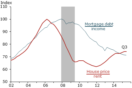
Figure 2 plots the house price-to-rent ratio and the mortgage debt-to-income ratio, each normalized to 100 at its pre-recession peak. The price-to-rent ratio (red line) reached an all-time high in early 2006, marking the apex of the housing bubble. Currently, the price-to-rent ratio is about 25% below the bubble peak. As house prices have recovered since 2011, so too has rent growth, providing some fundamental justification for the upward price movement.
Source: Flow of funds, Bureau of Economic Analysis (BEA), CoreLogic, and BLS.
Data are seasonally adjusted and indexed to 100 at pre-recession peak.
The mortgage debt-to-income ratio (blue line) reached an all-time high in late 2007, coinciding with the peak of the business cycle. An important lesson from history is that bubbles can be extraordinarily costly when accompanied by significant increases in borrowing. On this point, Irving Fisher (1933, p. 341) famously remarked, “over-investment and over-speculation are often important; but they would have far less serious results were they not conducted with borrowed money.”
As house prices rose during the mid-2000s, the lending industry marketed a range of exotic mortgage products to attract borrowers. These included loans requiring no down payment or documentation of income, monthly payments for interest only or less, and adjustable-rate mortgages with low introductory “teaser” rates that reset higher over time. While these were sold as a way to keep monthly payments affordable for new homebuyers, the exotic lending products paradoxically harmed affordability by fueling the price run-up. Empirical studies show that house prices rose faster in places where subprime and exotic mortgages were more prevalent. Furthermore, past house price appreciation in a given area significantly improved loan approval rates in that area (see Gelain, Lansing, and Natvik 2015 for a summary of the evidence).
The official report of the U.S. Financial Crisis Inquiry Commission (2011) states: “Despite the expressed view of many on Wall Street and in Washington that the crisis could not have been foreseen or avoided, there were warning signs. The tragedy was that they were ignored or discounted” (p. xvii). The report lists such red flags as “an explosion in risky subprime lending and securitization, an unsustainable rise in housing prices, widespread reports of egregious and predatory lending practices, [and] dramatic increases in household mortgage debt.”
Figure 2 shows that the house price-to-rent ratio and the mortgage debt-to-income ratio rose together in the mid-2000s, creating a self-reinforcing feedback loop. Since 2011, however, the two ratios have moved in opposite directions; the recent increase in housing valuation has not been associated with an increase in household leverage. Rather, leverage has continued to decline, reflecting a return of prudent lending practices, more vigilant regulatory oversight, and efforts by consumers to repair their balance sheets. The “red flags” are not evident in the current housing recovery. These observations help allay concerns about another credit-fueled bubble.
Bubble Consequences are Long-Lasting
Advocates of leaning against bubbles point out that excessive run-ups in asset prices can distort economic decisions, including employee hiring, contributing to imbalances that may take years to unwind. For example, during the late 1990s stock market bubble, firms overspent massively in acquiring new technology and building new productive capacity—with an attendant increase in their employee head count. This took place in an effort to satisfy a level of demand for their products that proved to be unsustainable (Lansing 2003). Similarly, the housing bubble of the mid-2000s had a profound impact on employment. This can be seen by comparing payroll employment in states with the largest house price booms to those with the smallest booms.
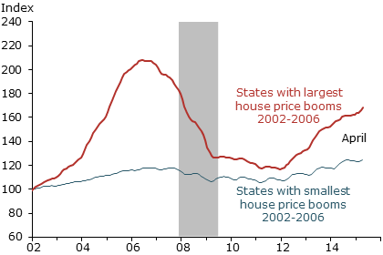
Figure 3 shows the path of house prices for two groups of states that had the largest and smallest booms. For comparison, each series shows the simple average house price index across states, normalized to 100 at the beginning of 2002. Each group of states accounts for about 20% of the U.S. population. The states with the largest house price booms from 2002 to 2006 are Hawaii, Florida, Nevada, California, and Arizona. The states with smallest house price booms include a larger number of states mostly in the Midwest.
Source: CoreLogic, data indexed to 100 in 2002. Note: Largest boom states: HI, FL, NV, CA, and AZ.
Smallest boom states: MS, ND, OK, SD, KY, CO, ID, NE, OH, IN, and MI.
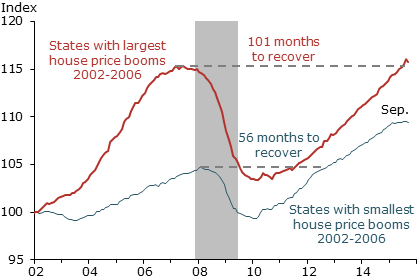
Figure 4 compares paths of the average payroll employment index in the same two groups of states, again normalized to 100 at the beginning of 2002. The states with the largest house price run-ups experienced much faster employment growth during the boom years and more severe employment drops during the bust years. In other words, the recession was more painful in states with large prior house price booms. A similar pattern can be found in cross-country data on house prices and measures of recession severity (Glick and Lansing 2010 and International Monetary Fund 2012).
Source: BLS and CoreLogic. Note: Largest boom states: HI, FL, NV, CA, and AZ.
Smallest boom states: MS, ND, OK, SD, KY, CO, ID, NE, OH, IN, and MI.
For most of the recovery period since mid-2009, the pace of job growth in the two groups of states has been about the same. Consequently, the states with large house price booms took 101 months to recover to their prior peak levels of employment—nearly twice as long as the states with small booms, whose recovery took 56 months. This illustrates another typical feature of credit-fueled bubbles: the significant and long-lasting effects on the economy after the bubble bursts (Bank for International Settlements 2014).
Conclusion
The bursting of an enormous credit-fueled housing bubble during the mid-2000s resulted in a severe recession, the effects of which are still evident more than six years after the episode officially ended. Since bottoming out in 2011, the median U.S. house price has rebounded strongly. However, the latest boom exhibits a less-pronounced increase in the house price-to-rent ratio and an outright decline in the ratio of household mortgage debt to personal disposable income—a pattern that is very different from the prior episode. Nevertheless, given that housing booms and busts can have significant and long-lasting effects on employment and other parts of the economy, policymakers and regulators must remain vigilant to prevent a replay of the mid-2000s experience.
